
Scary Mommy Website Redesign
Product/UX Design Intern @ Some Spider Studios

Time
06/2018 - 09/2018 (13 weeks)
Team
Designers, Engineers, Content Strategists
Role
Full-stack Product Design

Background

Some Spider Studios
Noun. A fast-growing NEA-led Series-A digital media startup building iconic brands that lead their space.
Fun fact: The name of the company, ‘Some Spider Studios’, was inspired by the all-time favorite Charlotte’s Web with its iconic phrase ‘Some Pig’.

Scary Mommy
Noun. One of the largest women brands in US with 500M unique reach owned by Some Spider Studios.
Why Redesign
Scary Mommy has been growing from a blog into a lifestyle brand with a variety of content. However, the majority of the user traffic still only goes to text-based articles. As a result, the current website design doesn’t reflect all the other content Scary Mommy offers (e.g. videos, e-commerce) and hence results in short-lived and weak engagement with the users.
In addition, the current website is an MVP version that hasn’t received any major design updates since creation and therefore in dire need of a systemic upgrade.

Objectives
Drive more traffic to the website & better capture users’ lifetime value by delivering a better onsite user experience.
Research
There were 3 key data points identified from the research phase:
The bounce rate for Scary Mommy is 98.5%.
Over 90% of Scary Mommy’s traffic comes from mobile.
Over 80% of Scary Mommy’s traffic comes from Facebook.
This indicates that, under most user scenarios, a typical user journey is:
Facebook -> Article Page -> Facebook
Hence, the only touchpoint on Scary Mommy for almost any user throughout the entire journey is the article page on mobile.
Define
Therefore, moving forward, how might we redesign the article page on mobile to retain more users (hence lower the bounce rate) and create more concrete engagement?
Ideate & Prototype
I started by brainstorming and exploring various features for the article page that could potentially address the issue at hand through paper sketches. And the final result, after several rounds of iterations, is as shown below:

From there, I condensed and combined the ideas I generated into 4 main features which I took to Sketch and prototyped at higher fidelity, as explained below:


And finally, putting everything together:

As I was finishing up redesigning the article page which is the 1st touchpoint for users coming to our site, I began to consider the rest of the user’s journey. One essential feature people rely on for efficient and effective content discovery is the navigation. However, as I dived deeper into my research, I discovered 2 main problems with our site’s current navigation design:
The site taxonomy is a complete mess. It is massive and outdated. Editors always have a hard time uploading content to the desired categories and the information architecture is not in line with user habit as indicated by content popularity data.
The navigation design on the front end is not consistent with best practices and compromises content discoverability.
Site Taxonomy
To solve the first part of the problem, I partnered with the editorial team to completely rethink the site taxonomy with 3 goals in mind:
To bette reflect our offerings
To make our website easier to navigate
To make the backend more intuitive to use for the editorial team
After several team meetings and iterations, the final result is as shown below:

The site taxonomy redesign was guided by 2 principles:
It is consistent with content popularity data. For example, ‘News’ and ‘Sex & Relationships’ are categories with most views which means higher ranks and hence greater exposure. And given people’s interest in various issues moms face based on the search result, ‘Mom Support’ was created as a new category.
It is simple and easy to be used by the editorial team. I consolidated over 100 categories we previously hosted on our Wordpress backend into 12, by merging categories of similar topics and deleting the ones that are no longer used.
Navigation Design
At the same time, I began to redesign the navigation on the front end. And here’s the result after the 1st iteration:

Some key points:
Keeping consistent with the article page, menu button is moved to the left.
For better content discoverability, the hamburger menu button is replaced by a set of tabs that provides direct access to content and only appears after user starts scrolling to save screen estate.
The redesign was then brought in for design critique. And based on the feedback from various stakeholders, the final result is as shown below:

Some key points:
While the 1st iteration only considered the homepage, the 2nd round extended to all pages and components.
The redesigned site taxonomy was incorporated.
Visual design overall is cleaner and more consistent with brand identity.
Drop-down menu extends full-width to reduce visual clutter as user uses the navigation.
Interactive Prototype
In collaboration with the team, I then combined everything into an interactive prototype as shown below. (Ideally, the top nav bar will shrink as user starts scrolling up but InVision currently doesn’t support such functionality. As a workaround, click the top-left corner of the homepage to experience the intended effect.)
Testing…?
As the prototype came to life, although it had been rigorously evaluated during internal design critiques, it was finally time to gather some feedback from our actual users. However, amidst all the excitement and nervousness, there was one catch: at Some Spider, there was only experience in conducting live A/B testing. This means everything has to be coded up before being put into test. While this may work for article headlines or cover image, it’s simply infeasible to build an entire website just for conducting preliminary tests. This constraint, coupled with my long-time desire to talk with the actual users of our website (at least that’s one of the triggers), led to the next section of this case study.

Overview
My initiative started in week 7 and consisted of 2 parts, namely primary user research and user testing.
Rationale
Primary User Research
Understand the ‘Why’. There were many moments when I wondered why user would behave in one way or the other. And I believe primary user research could help. Unlike secondary user research (Google Analytics, Best practices etc.) that focuses on ‘what’ and ‘how’ users are interacting with our website, content and brand, primary user research offers insights and a better understanding of ‘why’. With results captured as user journeys, primary user research digs deeper into users’ motivation and has the potential to fill the gaps in our understanding, offer new perspectives and scenarios that have never been considered before and fundamentally improve and inform the design decisions we make.
Build empathy. During the weekly design critiques and frequent meet-ups among the team, I began to notice that a lot of discussions were centered around ourselves. There were many ‘I think’ and ‘I wish’ but not enough consideration of ‘what the user may experience’. By directly talking with the users, it brings user’s voice to the table at our next meeting or discussion. And by connecting with our users and building empathy for them, we can truly build a website and brand whose voice, which is arguably our largest asset and competitive advantage, resonates with users on a deeper and emotional level.
Mature the design process and identify new opportunities for growth. Some Spider has been growing rapidly for the past 3 years since founding and primary user research could potentially help the company identify new opportunities for growth.
User Testing
Iterate at a faster rate. The proposed user testing sessions, through its usage of 3rd-party testing services (e.g. UserTesting.com, Optimal Workshop), avoid the need to go through the entire product development cycle and are therefore capable of testing designs at a much faster rate with less resources required. Coupled with constant and immediate user feedback, this means much faster iterations and hence increased chances of arriving at a truly great design.
Uncover unexpected insights. The proposed user testing sessions, by testing one version at a time with users and gathering immediate feedback, offer the opportunity to uncover unexpected insights, provide an understanding of exactly why a particular design succeeded or failed and capture the designs that are potentially well beyond the scope and imagination of our initial concept.
Free up limited development resources. We only have 3 full-time engineers on the team who all have a lot of responsibilities. The proposed user testing sessions would help free up and focus the valuable development resources on the most important tasks.
And on a higher level, I hoped that both primary user research and user testing could become integral parts of the overall design process at Some Spider.
Preamble
Detailing my reasons as stated above together with a step-by-step execution plan, I submitted my proposal and pitched the idea to Julie, my direct manager and the Head of Design. She was very supportive and went on to discuss my initiative among the company leaders. About 2 days later, I received the approval together with $600 as the kickstart fund.
Right, time to turn the plan into reality.
Primary User Research
For primary user research, I decided to conduct in-person user interviews with the aim to better understand our users through face-to-face conversations. The flow of execution is as shown below.

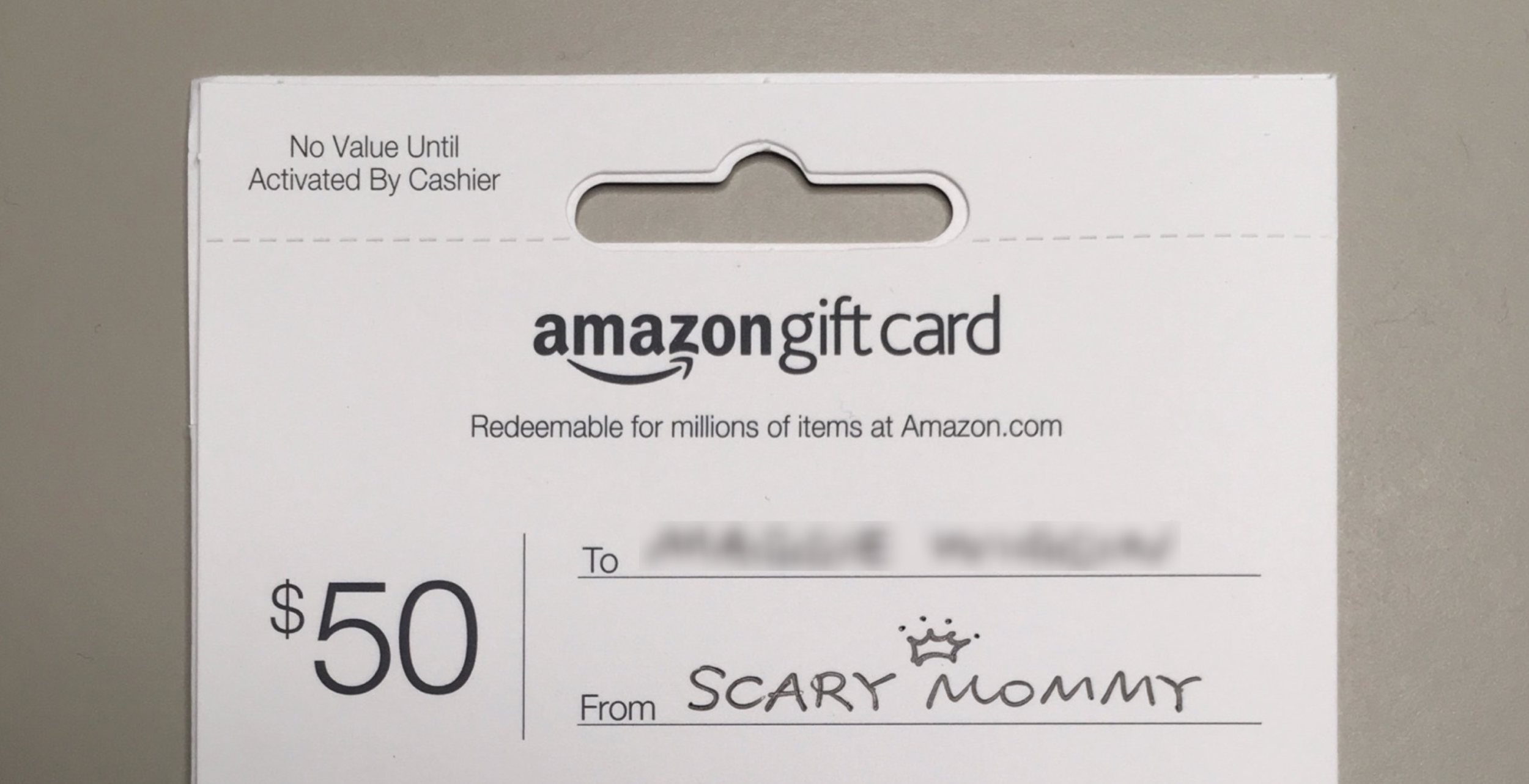
Just thought it would be a nice touch to address the gift card to each participant by name (blurred here for privacy)
Out of over 150 responses, I selected 10 participants and successfully interviewed 9 at our office over the span of a week. Each participant received a $50 gift card. I drafted and edited my list of questions and made sure I was well-prepared before every interview. Essentially, I treated each interview as an UX project and ensured that participants had a great experience participating in the interviews and visiting our office.
After all 9 interviews were completed, I distilled my notes and audio recordings (recorded at participants’ consent) down to a user persona and a customer journey map (developed under the AARRR framework (Acquisition, Activation, Retention, Revenue and Refer)). There were so many interesting findings that the customer journey map won’t be readable without zooming in. So I have included here the persona together with some of the most important and critical insights.

User Testing
For user testing, I started by looking into 3rd-party user testing services. Considering the budget, available capabilities, testing timeframe and many designs that could benefit from user testing, I chose to conduct tree test on the navigation structure on Optimal Workshop ($99 per study) and use the 3 free trials available on UserTesting.com to test the interactive prototype of our website.
I led and conducted the tree testing myself. And due to the time constraint of my internship, I only had time to lay the foundation for the prototype testing, with the rest of the work carried out by my awesome teammates after I left. So in this case study, I will focus on the tree testing, starting with my flow of execution as shown below.

There were in total 81 valid responses. There were again many interesting findings based on which I derived a list of insights and actions as summarized below.
Insight: ‘Miscarriage & Stillbirth’ is perceived not only as a pregnancy issue, but also an issue that signifies ‘Loss & Grieving’.
Action: Include content from ‘Miscarriage & Stillbirth’ under ‘Loss & Grieving’.
Insight: ‘Mental Health’ is perceived as a category where users seek help and support and one that cuts through multiple topics.
Action: As the first step, list ‘Mental Health’ under ‘Mom Support’. Depending on users’ interest, consider creating its own category with more specific sub-categories (postpartum depression etc.) down the road (‘Mental Health’ is currently ranked as the 9th most popular category last year and the 10th of all time).
Insight: ‘Infertility’ is primarily a pregnancy topic where users seek help and support. It is perceived to relate to ‘Sex’ as well.
Action: Cross-list ‘Infertility’ under ‘Mom Support’ and include its content under ‘Sex’.
Insight: A significant portion of the users (51/81) think ‘Baby Names’ is a topic that not only matters during pregnancy but stays relevant after the baby is born.
Action: Cross-list ‘Baby Names’ under ‘Kids’.
Insight: It can be observed from the data that there are a few categories that users associate with ‘Body Image', all with non-negligible click rates (For first clicks, 26 went for 'Mom Support', 20 went for 'Confess' and 13 went for 'Sex & Relationships', compared with 23 for ‘Lifestyle’ which is the correct path).
Action: Rather than cross-listing the content across every aforementioned category, consider adding links at the bottom of the ‘Body Image’ landing page that give users quick access to other landing pages associated with it. Depending on users’ interest, consider creating its own category down the road (‘Body Image’ is currently ranked as the 15th most popular category last year and the 18th of all time).
Insight: Some users are confused by what ‘Confess’ stands for (as reflected in the post-test questionnaire where one of the users even stated that ‘Confess seems to connotate stigma’).
Action: Consider changing ‘Confess’ to a title that’s less off-putting, especially for new users, such as ‘Confessions’. This also creates a better fit between user’s mental model and what the page actually offers.
Overall Results
Primary user research and user testing have since been introduced and integrated into the team’s design process. The results from tree testing have been incorporated into the next round of prototyping while the user persona and customer journey map have been used to guide designs, inspire product strategies and build better empathy for the users.
User traffic and engagement data from Google Analytics and Alexa will be updated here soon when the redesigned website goes live.
Learnings
Focus and identify the most critical problem. And solve it.
Don’t be afraid to take initiatives and strive to change things for the better.
And last but definitely not the least, through the user interviews, I have built greater empathy for moms as both a designer and a son. And I just want to say that being a mom is definitely not easy. I would like to pay respect to every mom out there. You are amazing and thank you so much.
That’s all for now. Thanks for reading!